Thursday, 11 October 2012
"Digital Me" Week 1 Task: Three Design Evaluations
http://greenhouse.fedehartman.com/
The above website in my opinion is a very good example of a clean sophisticated design which is well suited to the brand/company. The design is by a freelance company called Fede Hartman, based in Uruguay.
I particularly like the use of varying shades of green which perfectly match the company name and theme. Once every five seconds the main image changes into an alternative image through a smooth cross-fade transition which keeps the viewer interested. I like that on the left the green background fades into the image and the use of a curved shape outlining the image on the right, this shape also creates a shadow over the image which gives the page an almost three dimensional look.
The site has two navigation bars with identical links which is a bit unusual, the navigation at the top is simply text while the one along the bottom includes icon images and a brief summary of the content of each page. This may have been done just to fill the screen due to lack of content but it seems to work OK. Each navigation has mouse roll over effects such as text changing colour and block shadows, after looking at the source I believe this is done through javascript. One of the pages includes an embedded video which appears to be created using html5; this runs very smoothly and doesn't waste any time buffering.
Overall I think this is an excellent design. It is slightly lacking in content but makes up for it with a clean interface and rewarding interactive experience.
http://www.bountybev.com/home.html
The above website is a modern contemporary design with great interactive features. The design is by a company called Centresource Interactive Agency.
The site makes clever use of a scrolling one page layout with a winding road image linking the content areas; this is a novel feature which adds a fun element to the site. As the mouse hovers over the three featured brands the images change from monochrome to full colour and an animated text box appears; these small touches add class to the design.
In the 'contact us' area you will find a really nice example of html5 animation; as the mouse hovers over the truck it bobbles along the road to the right and then when the mouse moves away it reverses back into its original position. There is also an animated contact form which moves from a slanted position to straight to allow for easier typing.
Overall I think this is a great design; there are really nice subtle design features and it is interactive in a fun way.
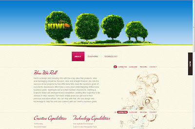
http://www.slimkiwi.com/
The above website is for and created by a web development company called Slim Kiwi based in Boston, USA. The design is straight forward but full of subtle clever interactive elements.
The site is split into three pages and two of these have one page scrolling layouts; this means that lots of content can be explored quickly and clearly, the content is easy to navigate and flows in a logical order.
I like the stylised font used for the headings which looks like neat handwriting. There is a rough paper like texture used as a backing to the main content area which looks great and works well with the overlaying fonts. I also like the way the contact section and a map of the company location is all nicely fitted into the footer area. The site also features a very informative portfolio section with all the different web designs and applications clearly laid out with colourful images supporting the text.
This website doesn't include any video or html animations but it doesn't need any of these as they would distract from an excellent focused, clear and straightforward design.
Subscribe to:
Post Comments (Atom)


No comments:
Post a Comment