Friday 23 November 2012

Voyage - feedback stage 3

I showed the third draft website to my lecturer, David, today and he told me the overall design was fine but I should add an extra index page for accessibility so browsers without javascript enabled can view some content. There is a line of code which checks if the browser supports javascript and either diverts it to a different page with full js content if enabled or stays on the same plain index page if not enabled. Here is the code I used:

<script language="javascript">
document.location.replace("index2.html");
</script>

Index is my plain splash screen with no js content and index2 is the full version with js. The plain index page is basically just the text that is contained within the map page and nothing else.

Here is a screen shot of the plain index page;


At this stage I have shown my design to all my class mates and lecturers. I received some very helpful feedback and implemented more or less everything that was suggested. I am confident that this 4th draft website will be the final version and I look forward to the presentation in a week.

Voyage - Feedback Stage 2

Today I showed my Second draft voyage website to my lecturer, Giselle, and got some useful feedback with tips on how I can improve my design. Here are the points that were raised:

- Put a space around the text in the header.
- Make the 'click on the map to enter' text in the header a different colour to make it stand out more.
- Make the text on the map page larger.
- Make city names standout more, try a different coloured text.
- Make Wikipedia links more visible, try underlining.

I implemented all these changes during my seminar this morning and also tidied my file structure by placing all images within my images folder.

Thursday 22 November 2012

Week 6 Task: Design a marketing strategy for your personal website

I have had my own website set up since November 2011 under the domain name http://nimahedayati.com. The site has evolved from being a simple portal to share my music to a full online portfolio showcasing all my multimedia work. The website was most recently updated earlier this month in preparation for the hand in of my Context 2 portfolio assignment.

My website currently serves the purpose of sharing my artwork and selling myself as a multimedia practitioner; this is to prepare me for placements and eventually full time employment after completing my degree.

Since the website launched I have thought of ways to promote it; this includes linking it from other existing social networking sites such as Facebook, Twitter and Reverbnation. I have also made sure that my page titles include my name and had a simple domain name which helps bring my site to the top of the list when searching my name in Google. Today I have set up an account with Google Analytics and copied a bit of javascript onto each of my website pages to allow Google to track the number of visits I get and the demographic of my visitors. Here is the overview page on my analytics account:


At the moment the stats all say zero visits as I have just set up the tracker. I will visit this again every few weeks and hopefully see detailed reports of visits made to my website.

As well as promoting my website I am thinking of ways of making my name well known online as this will generate more Google searches and ultimately more visits to my website. One way I am doing this is through a new volunteer journalism job I have just started. I have started writing album reviews for a website called Metal Shock Finland which primarily reviews albums for worldwide metal bands. My first review has been published and can found at this location:

http://metalshockfinland.com/2012/11/21/review-hologram-earth-ep-2012/

The good thing about this job is that it gives me an opportunity to network and build friendships with musicians and Metal Shock staff worldwide which in the long term will help me build a reputation in media and hopefully find clients for web design work.

At this moment I believe my unique selling point is my dedication to promotion of music through blogs and effective web design. My target audience is anyone who shares my interest in music and wants to promote their work online; in the future I hope to expand my audience to all business sectors.

I expect my website and overall marketing strategy to evolve and improve as my skills improve in web design and journalism.

Tuesday 20 November 2012

Voyage Feedback Stage 1


I showed my first draft website to a few classmates and my lecturer and got some very useful feedback. As I already suspected I was told that the index page doesn't look very good but the main map page got some good reviews and seems to be good enough to keep as it is. I was told the button image looks very outdated and the header logo doesn't quite fit in with the overall design of the site. My lecturer specifically told me that I should replace the images on the index page with one background image of my world map and create a transition effect between this page and the map page. After the lecture I spent some time resolving these issues as best I could. Here are the steps I took:

  • I created a new index page and used a reduced size world map as the background image; this image was made to cover the screen using css.
  • I created a new header logo with text underneath. I added a line of css3 code to the word 'Voyage' to create a drop shadow and also a box shadow around the wrapper that surrounded the header.
  • I kept the slideshow but reduced the size of the images to make it fit to the right of the logo within the header; the text was floated left and the slideshow was floated right to create this alignment.
  • I added a new jquery routine to both of my pages which added a cross disolve between each page; I am very happy with this effect as it looks quite slick. I learned how to do this through an online tutorial which can be found at http://www.onextrapixel.com/2010/02/23/how-to-use-jquery-to-make-slick-page-transitions/
  Here are the three javascript routines I have used on my website so far:
  1. Jquery cross-fading slideshow on index page.
  2. Jquery cross disolve page transition on index and map pages.
  3. Jquery image map scrolling on map page.
Here is a screen shot of the new index page:


At this stage I am happy with the outcome of this project but I will again seek more feedback from other lecturer's and make any necessary changes.

Sunday 18 November 2012

Voyage Project Development Stage

After extensive online research into jquery I have managed to put together my Voyage idea in Dreamweaver. The website does exactly what I intended it to do but in a very simple yet interactive way.

Here are screen shots of the two main pages of my website:


The image above is my index page which acts as an introductory splash screen. I have incorporated two separate javascript elements into this page; one is the slideshow and the second is the rollover button. The slideshow is a simple jquery script which enabled me to layer 5 images of the same size on top of each other on the z axis and then cross-fade between these images every 2 seconds. The rollover button is a simple javascript element which switches the image from a red button to a green button when the mouse hovers over it.


The image above is my map page which is the main section of my website. Instead of having 5 separate html pages for each city, I have created one page with a separate div area for each city; as you click on the city name on the navigation or click on the red location pointers the screen scrolls across to the selected area and brings up a text box with a little information about each city. At the bottom of each text box there is also a link to a Wikipedia page with extensive information about that city.

Unfortunately my knowledge of javascript is very limited at the moment and it would have been impossible for me to write a code from scratch that would achieve this effect; therefore I downloaded a jquery plug-in from the following website: http://www.jscraft.net/plugins/craftmap.html

I made adjustments to the code to tailor the website to my own design and content. I changed the navigation list to the specific cities I was using, changed the background image to a large world map image of my own choice, changed the co-ordinates of the city markers and the content within each text box. Finding the exact co-ordinates for each city was the lengthiest process as I had to cross reference with google maps and used trial and error to get the pointers as close to the actual city locations as possible; this was tricky over a map that was 8192 px by 4096 px.

I now have a better understanding of how image mapping and scrolling using jquery works.

Evaluation 

Overall I am very happy with the outcome of this project. I feel my final website conveys my original idea effectively. I will seek feedback from my peers and lecturers before the project deadline and make any necessary changes.

Monday 12 November 2012

Voyage Project Idea


The above image is a background image I have chosen for my 'Voyage' project. My website will navigate through different areas of the world where I have lived or visited; for each place there will be some text and images to describe the location and why I was there. The five locations I have chosen are: Zahedan, Iran; Nottingham, England; Haifa, Israel; Perth, Australia and Florida, USA.

This will be a one page layout with each location being an area (div) within this background world image; as you click on each location the page will scroll to the location, zoom in and bring up some information about that place. I am currently learning how to create the jquery code to achieve this in my Tuesday seminars with David.

I hope to create a wire-frame of the website in the next few days and then will start putting all the text and images together. Watch this space for further development on this project.

Thursday 11 October 2012

"Digital Me" Week 1 Task: Three Design Evaluations


http://greenhouse.fedehartman.com/

The above website in my opinion is a very good example of a clean sophisticated design which is well suited to the brand/company. The design is by a freelance company called Fede Hartman, based in Uruguay.

I particularly like the use of varying shades of green which perfectly match the company name and theme. Once every five seconds the main image changes into an alternative image through a smooth cross-fade transition which keeps the viewer interested. I like that on the left the green background fades into the image and the use of a curved shape outlining the image on the right, this shape also creates a shadow over the image which gives the page an almost three dimensional look.

The site has two navigation bars with identical links which is a bit unusual, the navigation at the top is simply text while the one along the bottom includes icon images and a brief summary of the content of each page. This may have been done just to fill the screen due to lack of content but it seems to work OK. Each navigation has mouse roll over effects such as text changing colour and block shadows, after looking at the source I believe this is done through javascript. One of the pages includes an embedded video which appears to be created using html5; this runs very smoothly and doesn't waste any time buffering.

Overall I think this is an excellent design. It is slightly lacking in content but makes up for it with a clean interface and rewarding interactive experience.


http://www.bountybev.com/home.html

The above website is a modern contemporary design with great interactive features. The design is by a company called Centresource Interactive Agency.

The site makes clever use of a scrolling one page layout with a winding road image linking the content areas; this is a novel feature which adds a fun element to the site. As the mouse hovers over the three featured brands the images change from monochrome to full colour and an animated text box appears; these small touches add class to the design.

In the 'contact us' area you will find a really nice example of html5 animation; as the mouse hovers over the truck it bobbles along the road to the right and then when the mouse moves away it reverses back into its original position. There is also an animated contact form which moves from a slanted position to straight to allow for easier typing.

Overall I think this is a great design; there are really nice subtle design features and it is interactive in a fun way.


http://www.slimkiwi.com/

The above website is for and created by a web development company called Slim Kiwi based in Boston, USA. The design is straight forward but full of subtle clever interactive elements.

The site is split into three pages and two of these have one page scrolling layouts; this means that lots of content can be explored quickly and clearly, the content is easy to navigate and flows in a logical order.

I like the stylised font used for the headings which looks like neat handwriting. There is a rough paper like texture used as a backing to the main content area which looks great and works well with the overlaying fonts. I also like the way the contact section and a map of the company location is all nicely fitted into the footer area. The site also features a very informative portfolio section with all the different web designs and applications clearly laid out with colourful images supporting the text.

This website doesn't include any video or html animations but it doesn't need any of these as they would distract from an excellent focused, clear and straightforward design.

Saturday 5 May 2012

Virtual Environment Project


The video above is the animation I recently created for my DP2 virtual environment project.

The aim of the project was to create a superheroes lair in virtual modelling software called 3DS Max. The piece should include four interlinked spaces and a camera fly-through sequence.

The first stage of this project was to create an original superhero. After experimenting with several body shapes and characters I came up with the Egyptian mutant warrior 'Ant Man'; this is what he looks like:


The story for my superhero is that the Pharaoh had put a curse on one of his disloyal soldiers that mutated him into this  half ant creature and gave him eternal life; the ant man was charged with the task of protecting the pharaoh's tomb after the ruler had died. Three thousand years after the pharaoh died and was entombed within a pyramid there were many archaeologists who began to explore this site; there were also thieves who searched the pyramids for buried treasure. In the 19th and 20th century there were hundreds of explorers and thieves who dared to enter this pyramid but all were pierced by the ant man's arrows and left dead in the sand.  If they managed to escape from the ant man 
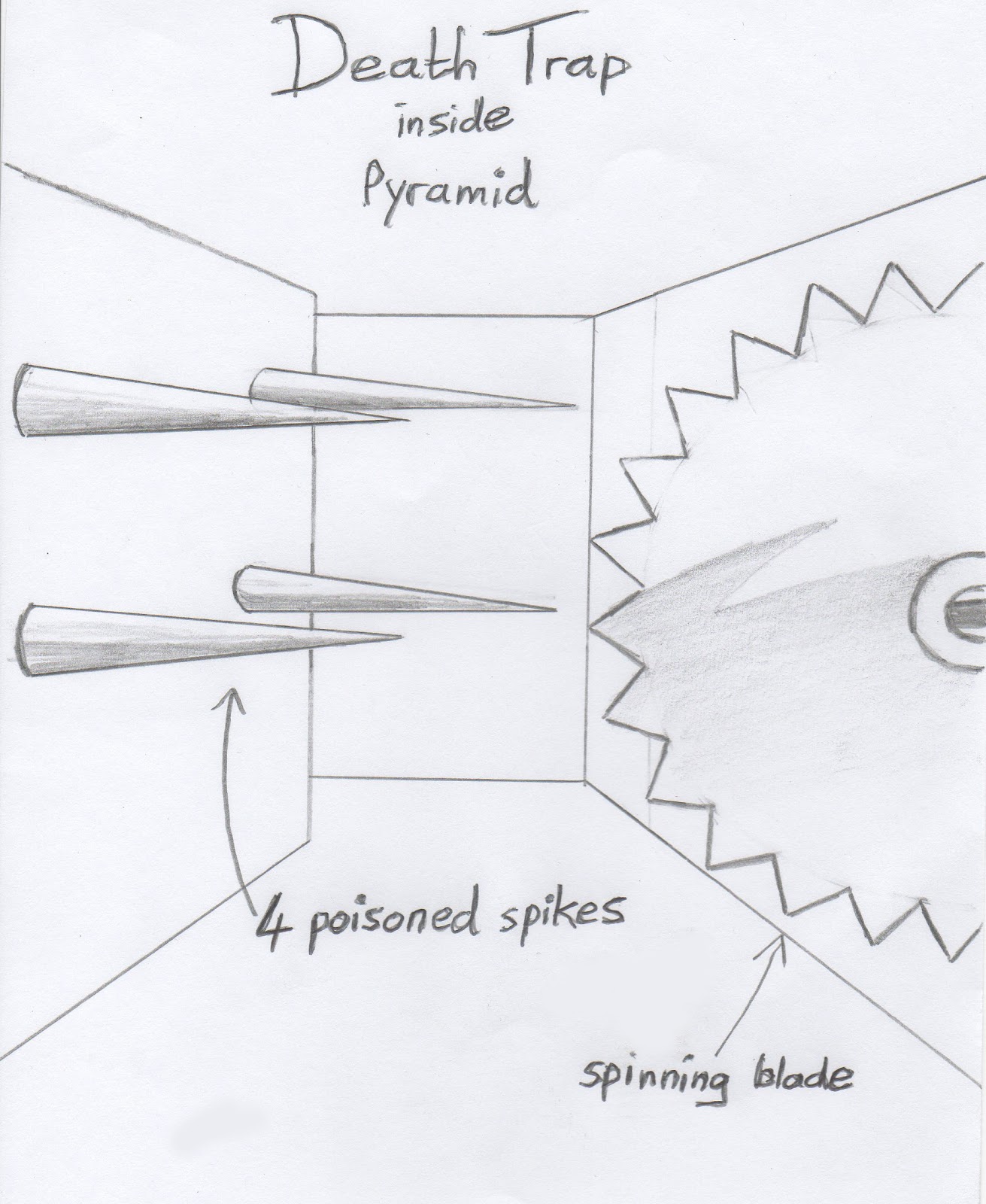
they would have to face the death trap inside the pyramid; this is a room containing a spinning blade and poisoned spikes which claimed the lives of many brave men.


After I created the superhero I decided that the environment would be the place the superhero must protect which is the pyramid containing the remains of the Pharaoh. Here is my design for the outside of the pyramid:


Below is my design for the inside of the pyramid.


After I had completed my design of the outside and inside of my pyramid I began modelling the environment within 3DS Max. I first began by creating the outside scene showing the camera approaching the entrance of the pyramid from outside. I then created a separate scene of the inside of the pyramid; the first step was to create an outline of the walls and extruding them to the height I needed, I then added a plane to every wall and on top of this added a texture. My textures were made of images of hieroglyphics and Eqyptian wall art.

In the death trap room I added 4 horizontal narrow cones which represent the poisoned spikes and a large star which represents the spinning blade.

Within the treasury room I also added several objects such as stacks of gold, silver and bronze coins, metal ornaments and a wooden treasure chest.

The centre piece of my environment is the pharaoh's sarcophagus which is basically a box with an image of a sarcophagus mapped on top.


Once I had completed modelling the walls, planes and objects I started to think about lighting and the camera. I added one light in each room; this was dimmed to 20 % to give a soft light effect, two lights were added to the corridor areas, these were dimmed to 10 %; I added these just to brighten the hieroglyphics on the walls which were otherwise just black planes in the dimmed lighting.  I then drew a line to represent the path the camera would follow; this roughly followed the path that an explorer might take if he managed to escape the ant man and pass through the death trap. I tried to make the line curved instead of having pointed angles so the camera movement would be smooth; however, this was difficult as the rooms were quite compact and required sharp turns around some of the angles.

After completing the modelling, lighting and camera path I rendered the entire sequence; it took approximately 35 minutes to render. I then imported the two scenes into Premiere where  I added cross dissolves and end credits. I also added music; the piece I used was from a track called 'Wheel of Time' by German heavy metal band 'Blind Guardian' , I liked this track as it uses an Egyptian scale and intricate tabla drumming.

Evaluation

If I had the opportunity to do this project again I would spend more time getting all the walls perfectly straight and corners exactly at 90 degrees, the textured planes would then fit perfectly onto the walls; I would also spend more time getting the camera path as smooth as possible.

Overall I am happy with the outcome of this project. Although there are small technical faults in the animation I think I have managed to convey the Egyptian theme I was looking for. 

Thursday 8 March 2012

Social Networking

It has been suggested to me that one of the best ways of promoting an artist’s work is through social networking; it is simple to do, free and you can reach a worldwide audience quickly.

As my art is mainly music I have found that one of the most effective networks is reverbnation and the reverbnation app within my facebook page. This allows me to upload and share music through paid or free downloads. I can also build a group of fans worldwide of people who are into my genre of music.

I have also experimented with other networks such as twitter and myspace. Twitter is excellent for building contacts and sharing announcements which can be music related or completely random. Myspace is quieter that it used to be so the only way to reach others is to actively add friends and promote my work through messages and status updates; however I find these can go unnoticed so I don't use myspace so much anymore.

I also use youtube, vimeo and soundcloud; not really to promote my music but as a way of storing music and video which can be embedded into other websites. I particularly like souncloud as it has very smart looking music players which actually show the waveform of the track.

I believe the best way to actively promote your work as an artist is to have a presence on as many networks as possible; also to have all these channels linked into a central hub which can be my personal portfolio website.

Thursday 1 March 2012

Optimisation task

In today's interactive media seminar I was given a task of optimising an image for use on a website.

The original image is a jpeg with dimensions of 1000 pixels by 1000 pixels at 300 dpi.


The image source is: http://en.wikipedia.org/wiki/File:SurfaceTension.jpg

The image above has a file size of 581 KB.

I re-sized the image using Photoshop to 500 pixels by 500 pixels at 150 dpi. Here is the result:


The image above has a file size of 329  KB.

I then saved the image as a gif at 500 pixels square; here is the result:


The file size of the gif image is 149 KB. The reduction in quality is clearly visible as the gif format does not use as many colours as jpeg; this is most noticeable in the green area in the bottom right corner of the image. I believe this format would be most suitable if there is an image with a small number of colours such as a logo or button; otherwise I would use jpegs for detailed images.

Contact form

I finally figured out a way to have an email contact form on my contact page instead of just a mail to link. I found a website which creates the form and runs the php for me without me having to set up my own server. I used this website to create the form: http://www.emailmeform.com/

Once I created the form from a template I copied the code into my contact page within the content area in the body. This is what the form looks like on my site:


One benefit of having this form is that people can send emails directly to my personal email account without them ever seeing my email address; this stops unwanted spam emails. My email address is hidden to the public and only exists within the server at emailmeform.com.

Sunday 26 February 2012

Fire Website (third version)

Today I had a chat with one of my relatives who is a graphic designer and got some useful tips about ways I can improve the visual aspect of my site. I was told that the imagery of fire matches my style and music rather than ice.

It was suggested that I try using a blue fire background rather than ice cubes and get rid of the snow flake design in the logo. I had an image of flames which I really liked and have used on other social media sites; I took this image and changed the colour balance so it turned blue but this did not look good at all. I decided it would be best to leave the flame background the original colour and instead changed the entire colour scheme of the site to match the fire colour. I redesigned the logo and added a small image of my guitar in the corner; this immediately shows the viewer that I am interested in rock music.

Here is a screen shot of the new design:


I also changed the colour of the unselected social media icons so they now match the red colour scheme (these were previously grey).

I am still looking for ways to improve my design so I will ask for more feedback from my tutor at the next session.

Saturday 25 February 2012

Ice Website (new design)

Here are a few screen shots of the first draft of my new web design. 

I showed the first draft to my tutor and got some helpful feedback:

- Make the background image more transparent so the logo stands out more.
- Change the links in the navigation to Javascript buttons.
- Change the Times New Roman font to a more attractive font such as Arial.
- Change the social media links into Icons (the default icons for those sites).
- Add an image to the home page to make it look more interesting.
- Add a mail form to the contact page instead of a mail to link.

I was able to implement all of the changes above except for the email form which I found far too complicated; I would have needed to create a separate PHP page which lots of complicated code to make it work, at this stage I do not have enough knowledge to make this happen but I will consider it for the future.

The second draft of my design can be found online at this link: http://nimahedayati.com

Here is a screen shot of the new and improved home page.


The 5 links on the left side of the navigation are buttons which change colour when the mouse rolls over them. The 7 social media icons on the right of the navigation are also buttons which change from monochrome to full colour when the mouse rolls over them. 

The other changes I made to the home page are:

- I added a purple gradient to the top of the background image to make the foreground logo stand out more.
- I added a small colourful image to add character to the page.
- I changed the font of the text in the content area to Arial.

As all the links are now in the navigation bar I got rid of the links page and replaced it with a news page which I will update regularly.

I believe that the changes I have made make the site slightly more professional looking and better from a design perspective. I know I still have much to learn about design and coding but I look forward to the challenge of creating websites for clients. I hope to extend my knowledge of design and coding over the next two years and gradually begin freelance work.

Fire Website (my old site)

Here is a screen shot of the home page of my 'fire' website which has now been removed and replaced.

Monday 20 February 2012

Mood Board


This is a mood board; I made it in my interactive media seminar last week. It shows a collection of images and fonts which represent my personality, the things I like and my cultural background. This is the first step in researching ideas which will be incorporated into my design of a portfolio website. The next step will be to refine my ideas by choosing colours, shapes and fonts to go in my website. My existing website (nimahedayati.com) uses a background of fire and brushed metal textures in the foreground; I was thinking of creating a mirror site with a contrasting theme of 'ice', this was inspired by 'ice and fire' which is a manifestation of the classical Chinese philosophy known as 'yin and yang', these are polar opposites or seemingly contrary forces which are interconnected and interdependent in the natural world. It is said that Yin is black and like ice or water whereas Yang is white and like fire. Here is a well known image which represents this:


Sunday 5 February 2012

DP2 – Film Project


This film was created over a five week period, starting in the second week in January and ending in the second week in February. Here is a summary of the filming schedule:

Week 1
Our lecturer Phil Nodding split the class into groups, each group with seven to eight people. Phil also provided each group with a script he had written; he gave us the task of interpreting the script and developing it into a short film. During the first seminar we watched examples of short films and TV programmes to give us an idea of camera angles and storytelling techniques.  

Week 2
We assigned a role to each member of the group and began to research the roles individually. As I have experience in music production and sound engineering I volunteered to do the sound recording. The other group member’s roles can be seen in the final credits of the film. We began to meet as a group outside of class to plan our pre-production; this included creating a storyboard and editing the script. We also started to think about costumes and actors.

Week 3
We had planned to start shooting our film on this week but we had difficulty finding actors; instead we used this time to test the camera, sound and lighting equipment. We inspected the location and tested the equipment while we were there; this helped us to plan the camera and lighting positions in advance of the shoot.

Week 4
By this time we had managed to complete the pre-production and found actors. The shoot began on Monday 30th January and ended on Wednesday 1st February. On all three days we tried to shoot within the early afternoon period (around 12pm to 4pm) so the lighting would be fairly consistent throughout. We had our storyboard and script with us during the shoot but we were still flexible with our choice of shots. After the previous film project we all knew that we would need a multitude of shots in order to make a good edit; therefore, we shot most scenes from more than one angle to allow for variations in individual edits.

Week 5
I began my individual edit on the Thursday of week 4 and finished on the Saturday night before week 5. I spent around 10 hours in total editing. I also spent around 6 hours composing, recording and mixing my own original music for the film on Saturday afternoon. The music was mixed in reason 4 and editing done in Adobe Premiere Pro CS5.5. While editing I used a variety of techniques to make my video and audio smoother. For the audio I used a compressor/limiter on all the dialogue; this increased the level of the quiet parts and decreased the level of the loud parts to give a balanced level on the dialogue track. The sound effects, atmosphere and music were all on separate audio tracks which did not require any compression. I also used cross fades between sound clips to eliminate clicks and pops in the audio. For the video I used colour correction and adjusted the brightness/contrast on some of the shots to give continuity in the lighting. I only used subtle amounts of colour correction as I didn’t want the video to look unnatural; as a result some of the shots are a bit darker and bluer than others. Overall I am happy with the way the film sounds and looks.

I chose to upload my completed film to YouTube instead of Vimeo; I did this as Vimeo has an upload limit of 500MB and I did not wish to compromise the quality of my 1.1GB video.

This has been a very challenging and time consuming project but very enjoyable. I wish to thank all the people I worked with to make this film; everyone worked hard and brought their own ideas and enthusiasm to make this project a success.